

Advancer began as a people and change management advisory firm, built on the belief that the best businesses put their people first. When AI began reshaping the workplace, they recognised the businesses who would win were those who brought their people along for the journey.
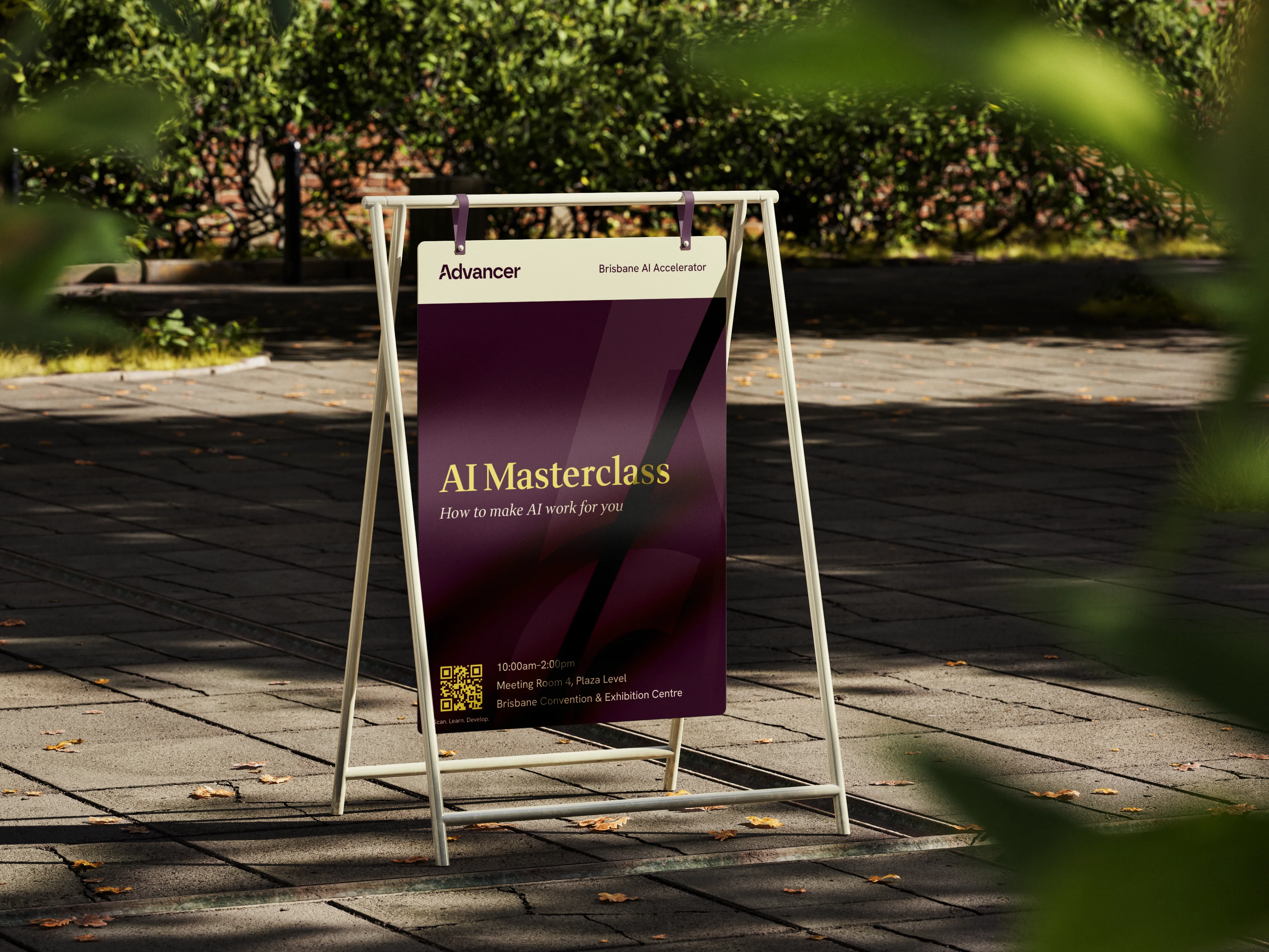
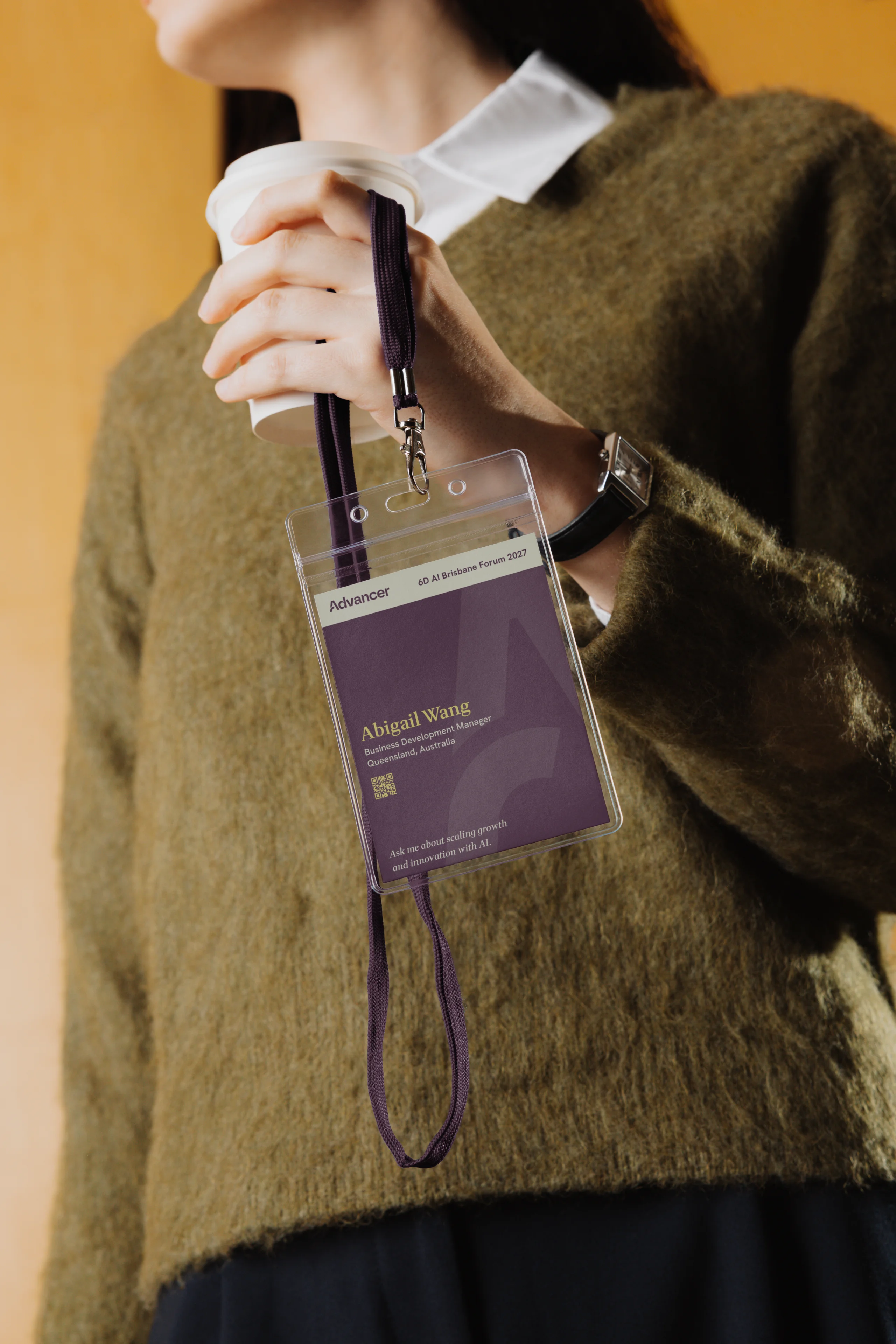
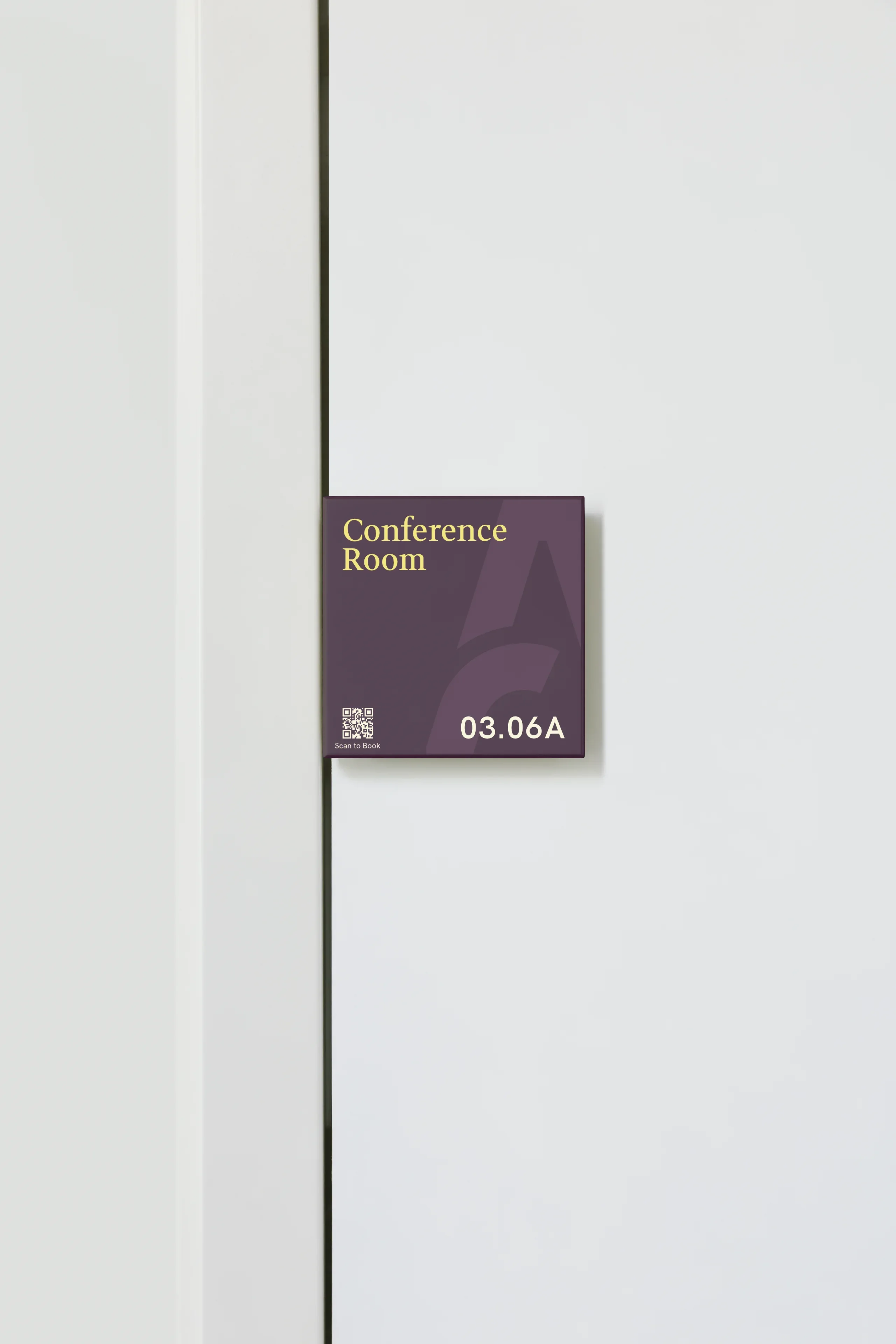
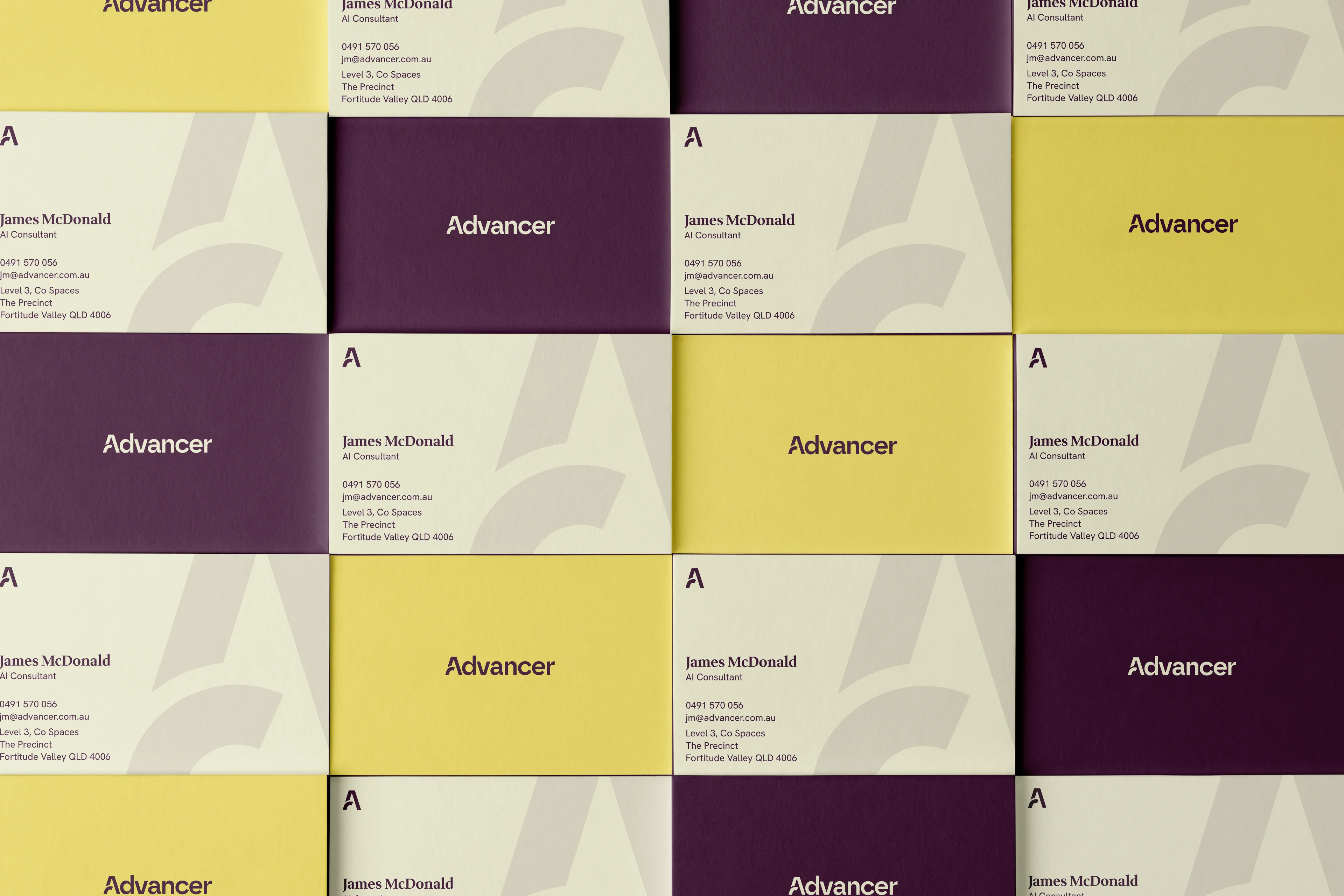
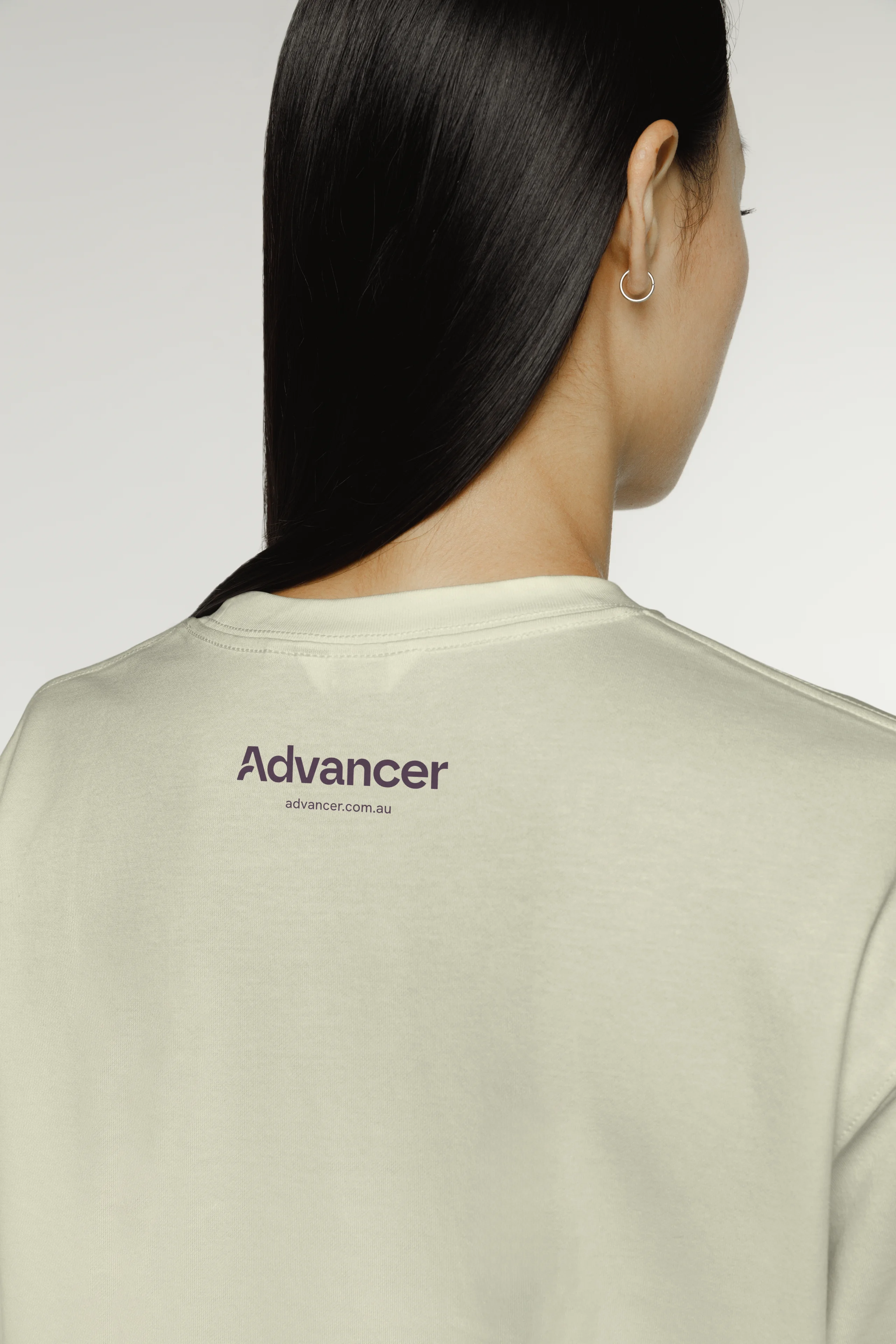
The rebranding elements for Advancer are based on implementing an approachable, warm personality to the brand—a vast contrast to the nature of work that the agency undertakes.
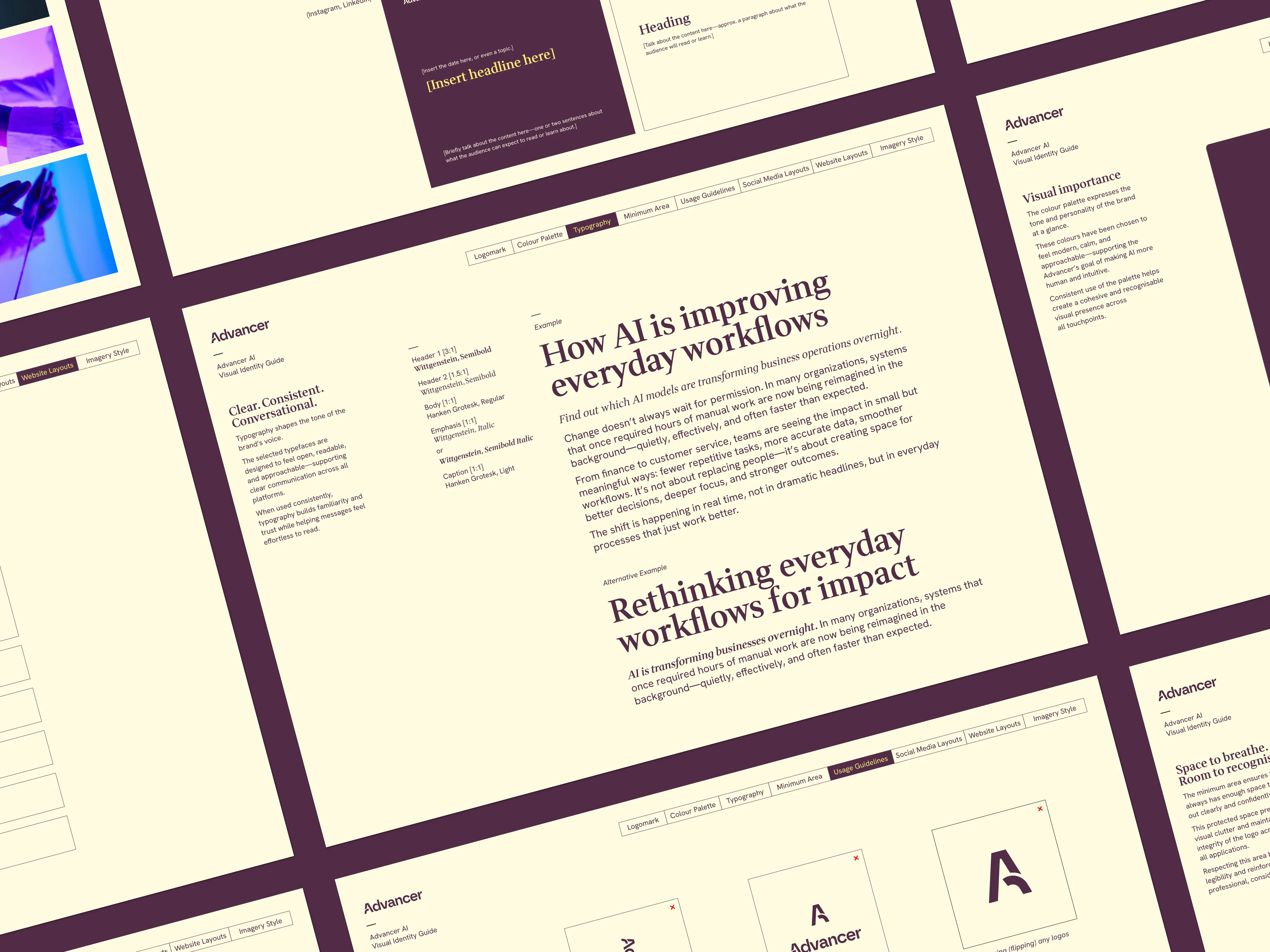
The primary focus for this concept is the mix of digital and tangible aspects that adds a personable touch to the brand. For example, I have used a neo-humanist typeface as a base for the wordmark which highlights double-story characters as well as printing ink traps.
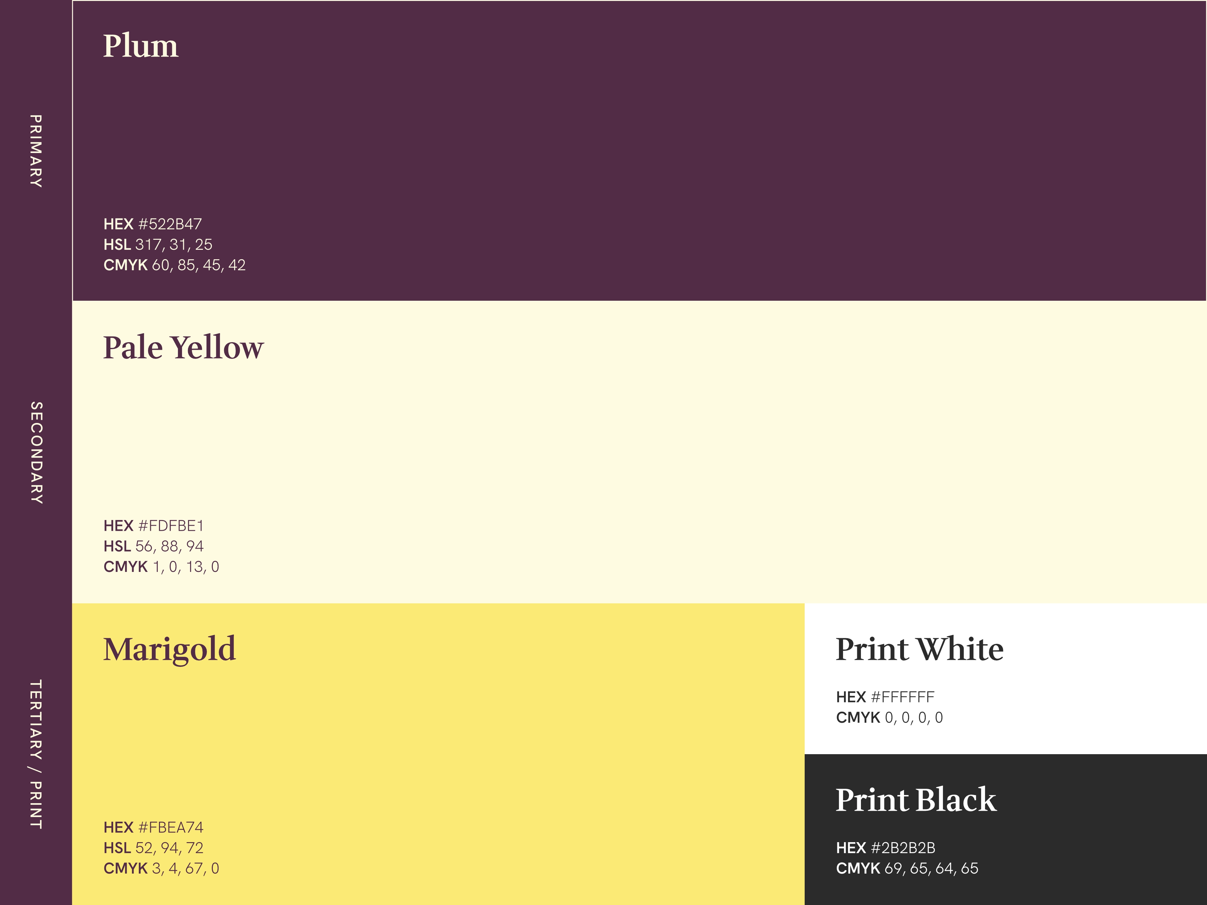
Developing Advancer's visual language, I combined pared-back hues with a strong yellow accent to create a distinct brand profile amongst other AI agencies.
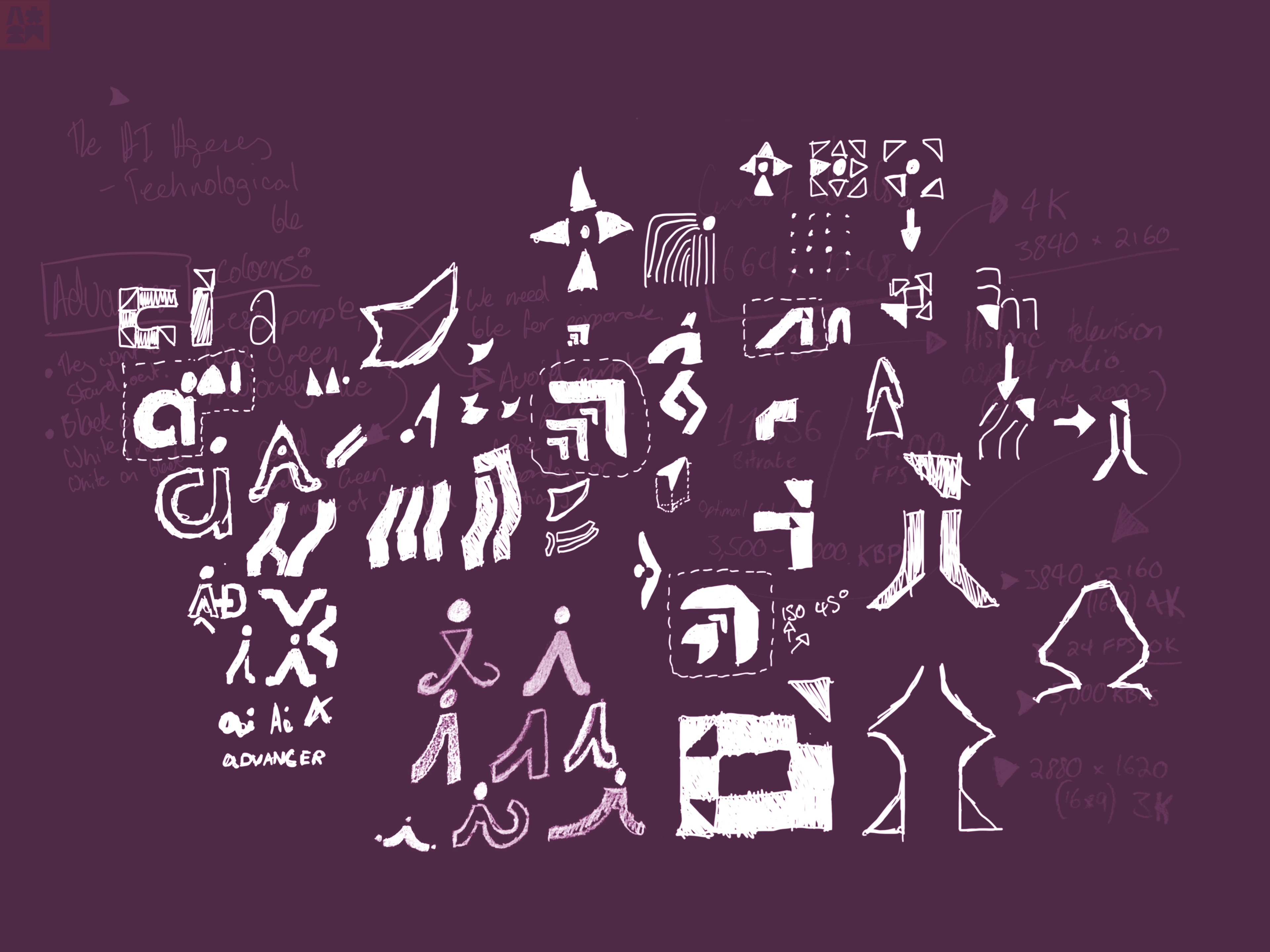
Maintaining familiarity with modern tech companies, I wanted to retain a geometric feel with a natural flourish. I explored directional marks, iterating with basic shapes and angled curves.
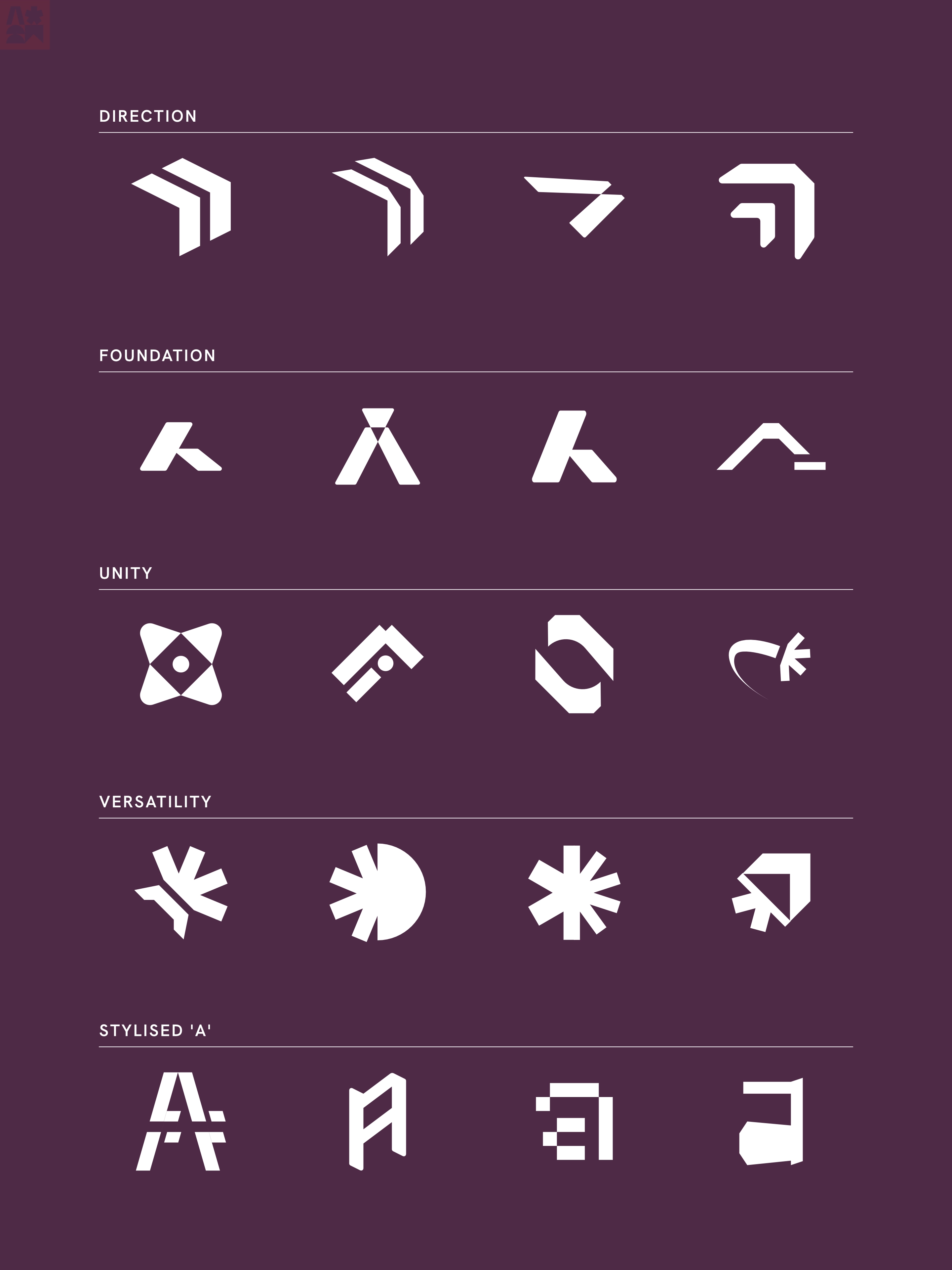
With vectorised sketches, I could easily categorise each iteration to determine a better design direction. With the sketches, I veered towards a logomark that demonstrated an unconventional direction which fits Advancer as an outlier amongst other AI agencies.


.svg)
Along with iconography and symbols iterated for the Advancer logo, integrated lettermarks were part of the design process to create a versatile language.
The third iteration was selected by the client to proceed into the identity production stage.
.webp)

.svg)
See completed projects, concepts, and case studies.
