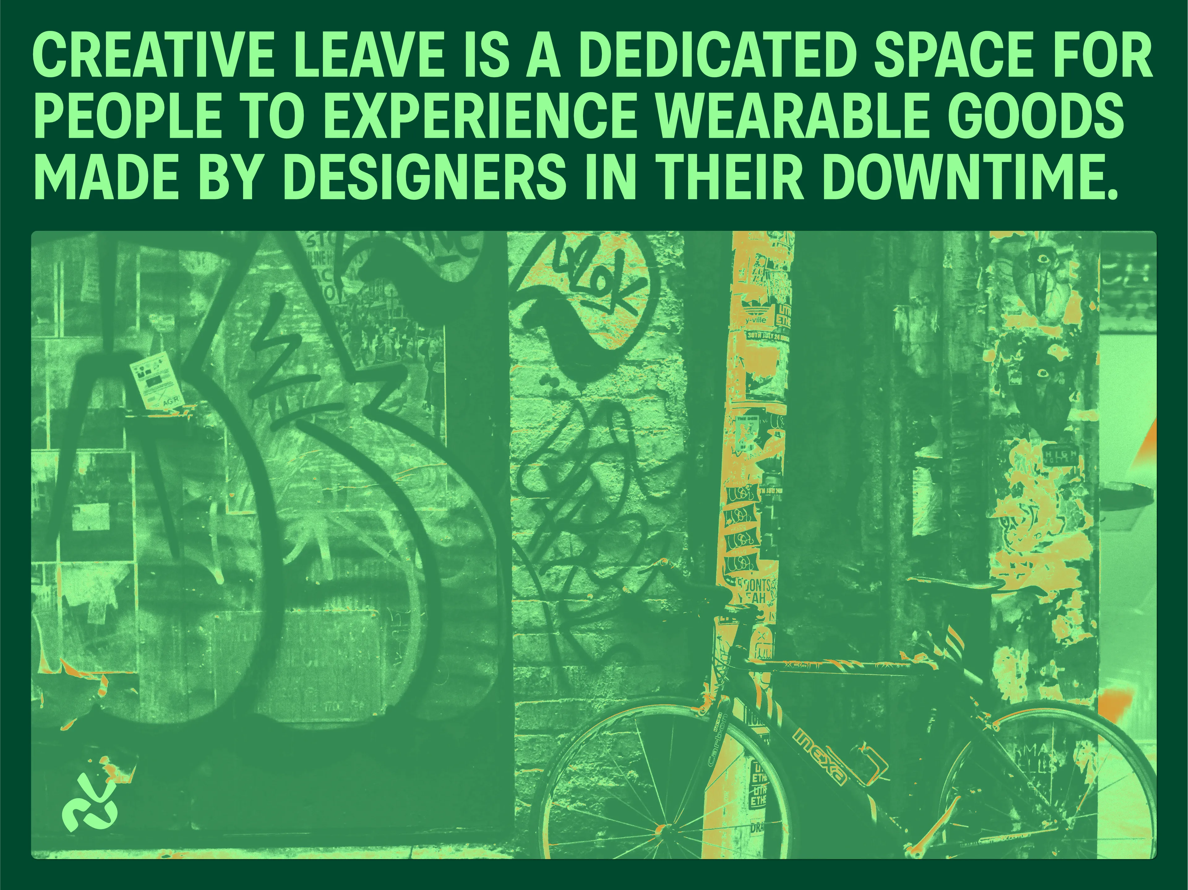
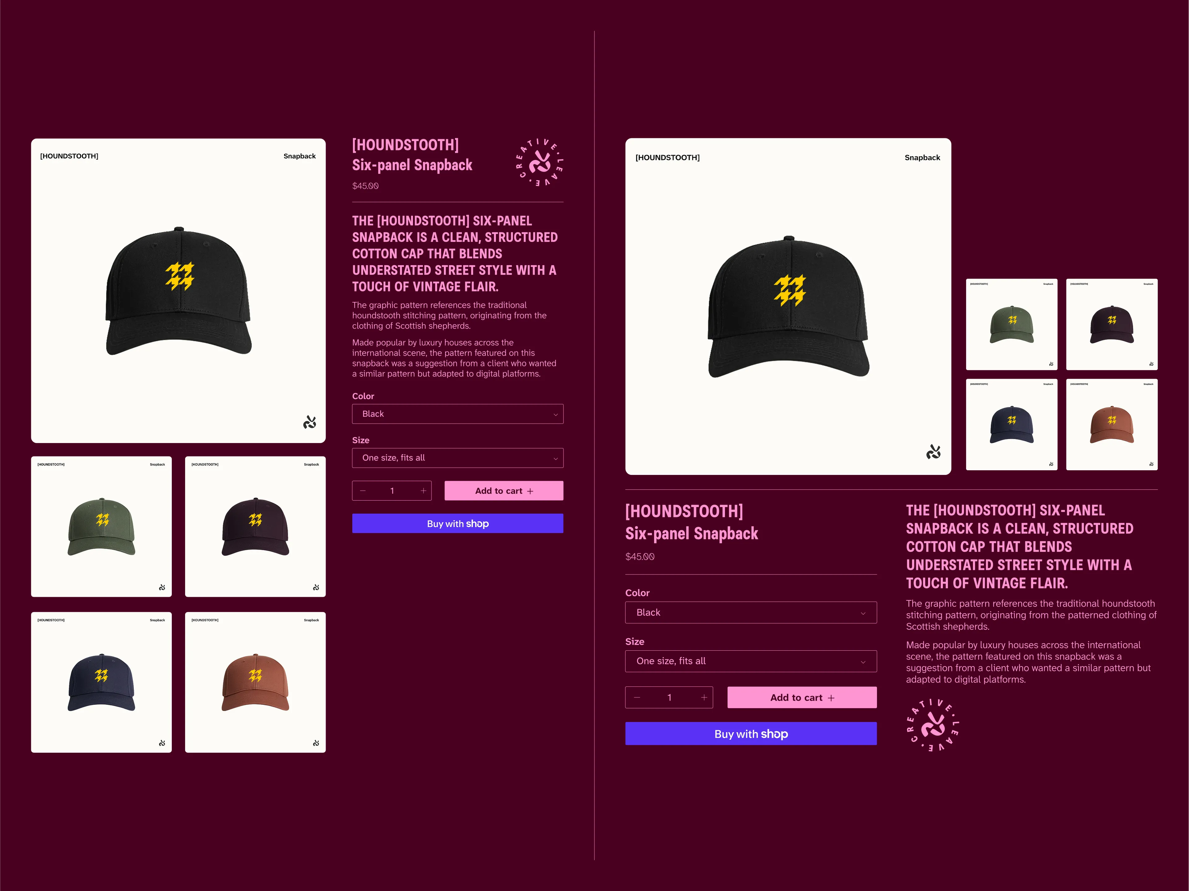
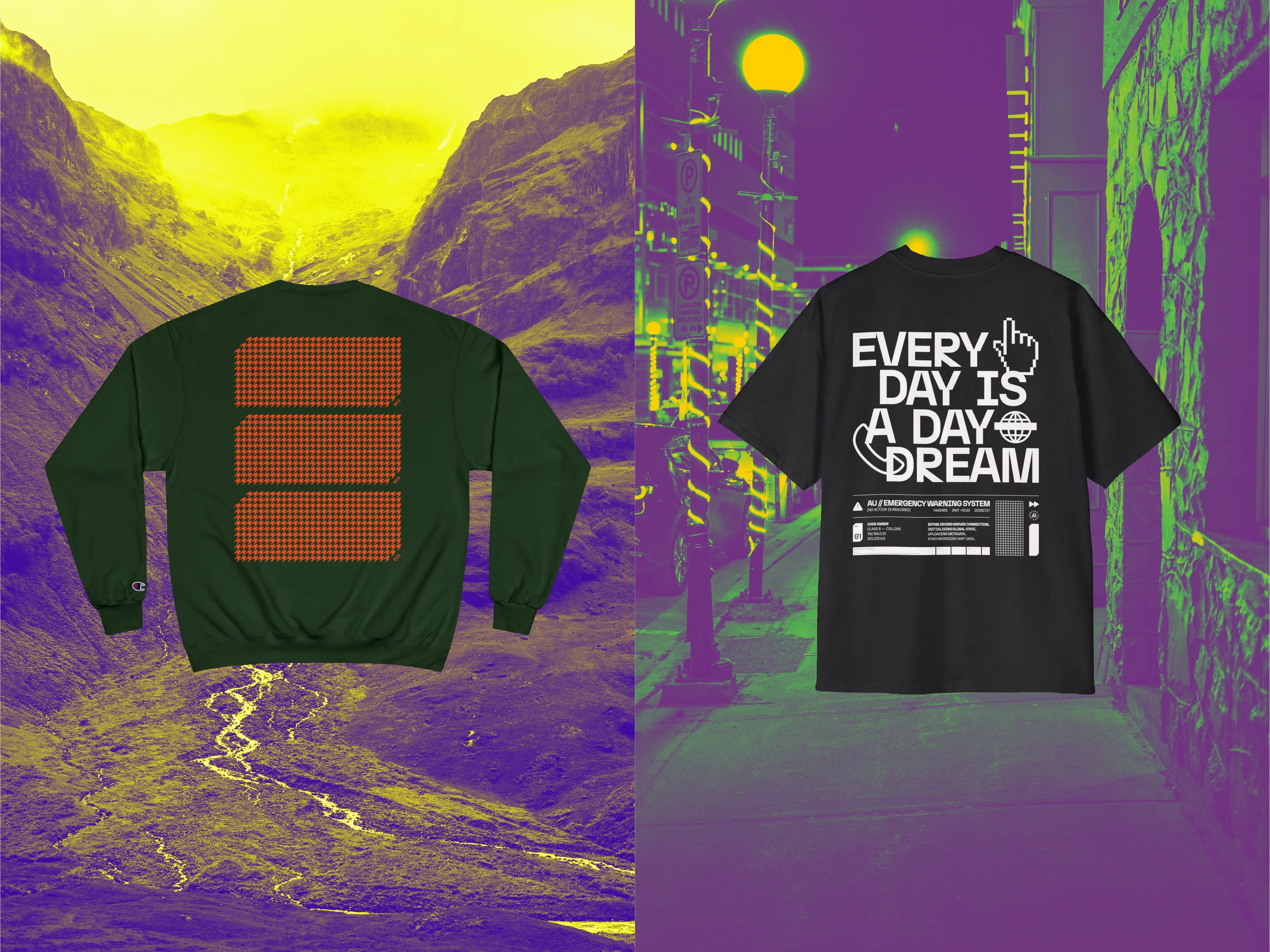
A digital home for playful sketches and unused project concepts, Creative Leave became a place to transform napkin ideas into something tangible and usable.
Taking advantage of the print-on-demand system, the story and meaning behind each design comes first—rather than prioritising commercial viability.
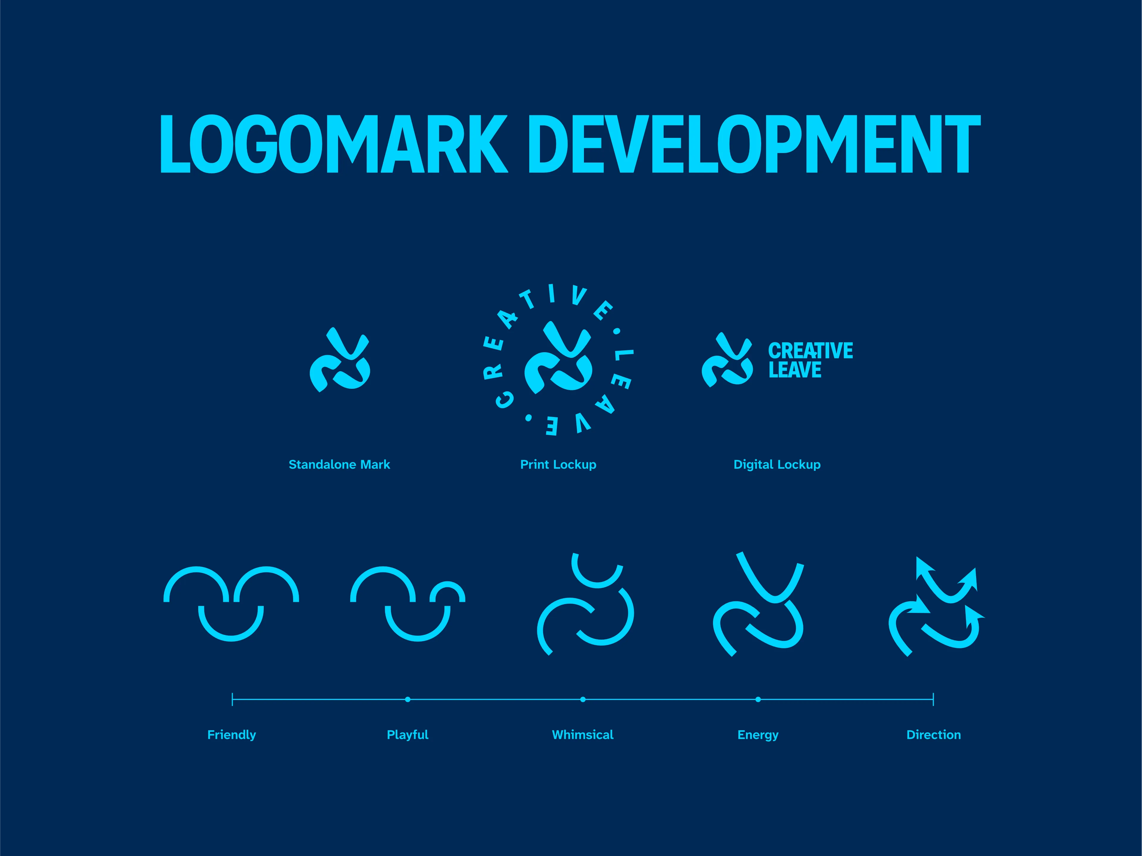
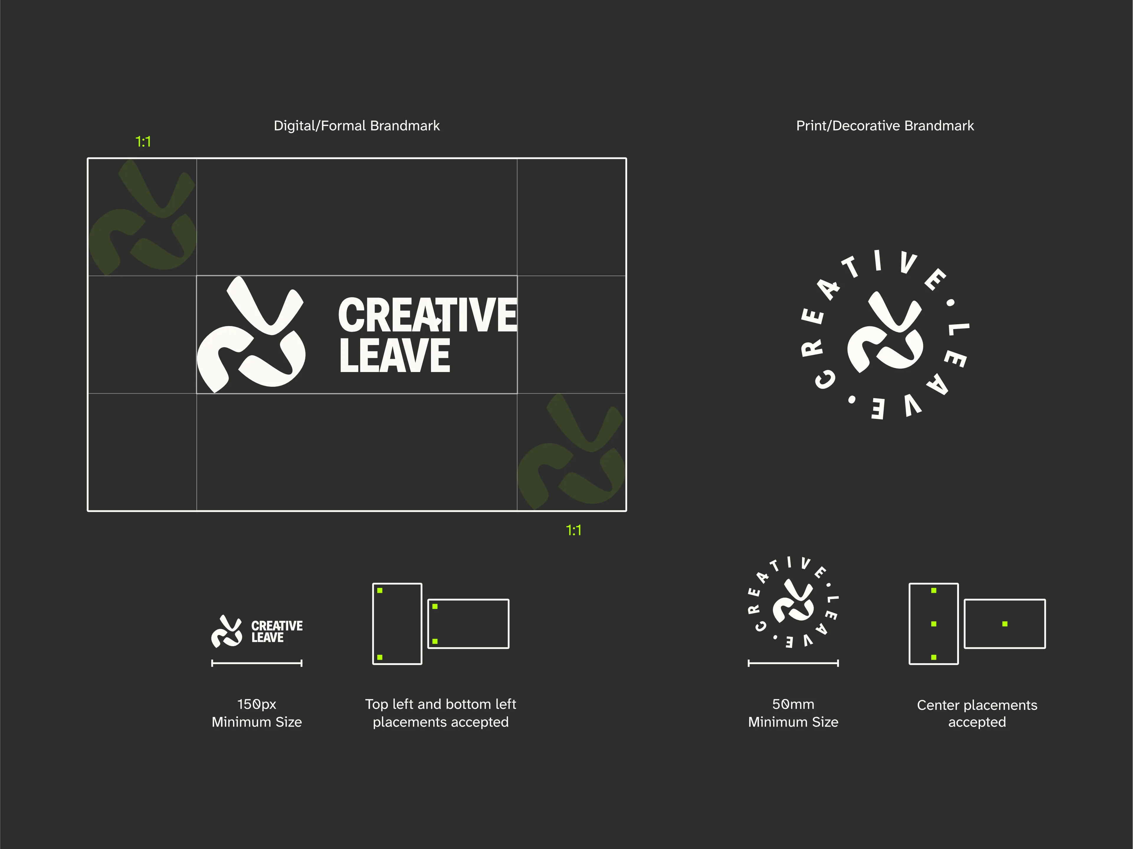
The logomark is designed as three curves, a heavily stylised smiley face that translates to the positive experience once concepts are realised into a product. To be able to design from pure creativity without restriction or penalties makes for a satisfying experience.
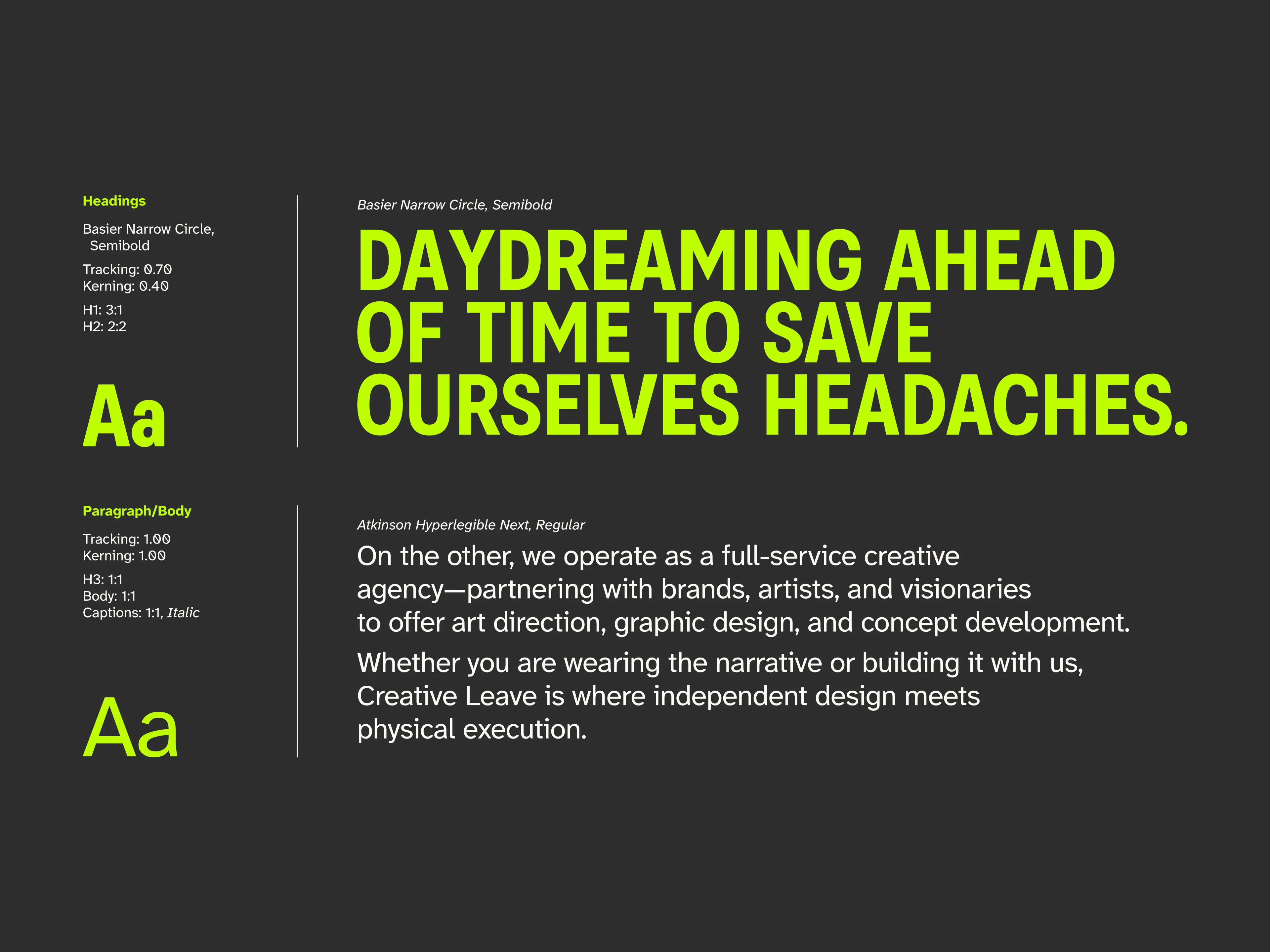
With a bold personality, the heading typeface showcases uppercase headings with considered kerning to creating a wanting of want to be seen and noticed. To pair for flexibility, a legibility-focused typeface closely follows that can be read clearly at various sizes to suit a wide range of audiences.
.svg)
See completed projects, concepts, and case studies.
