
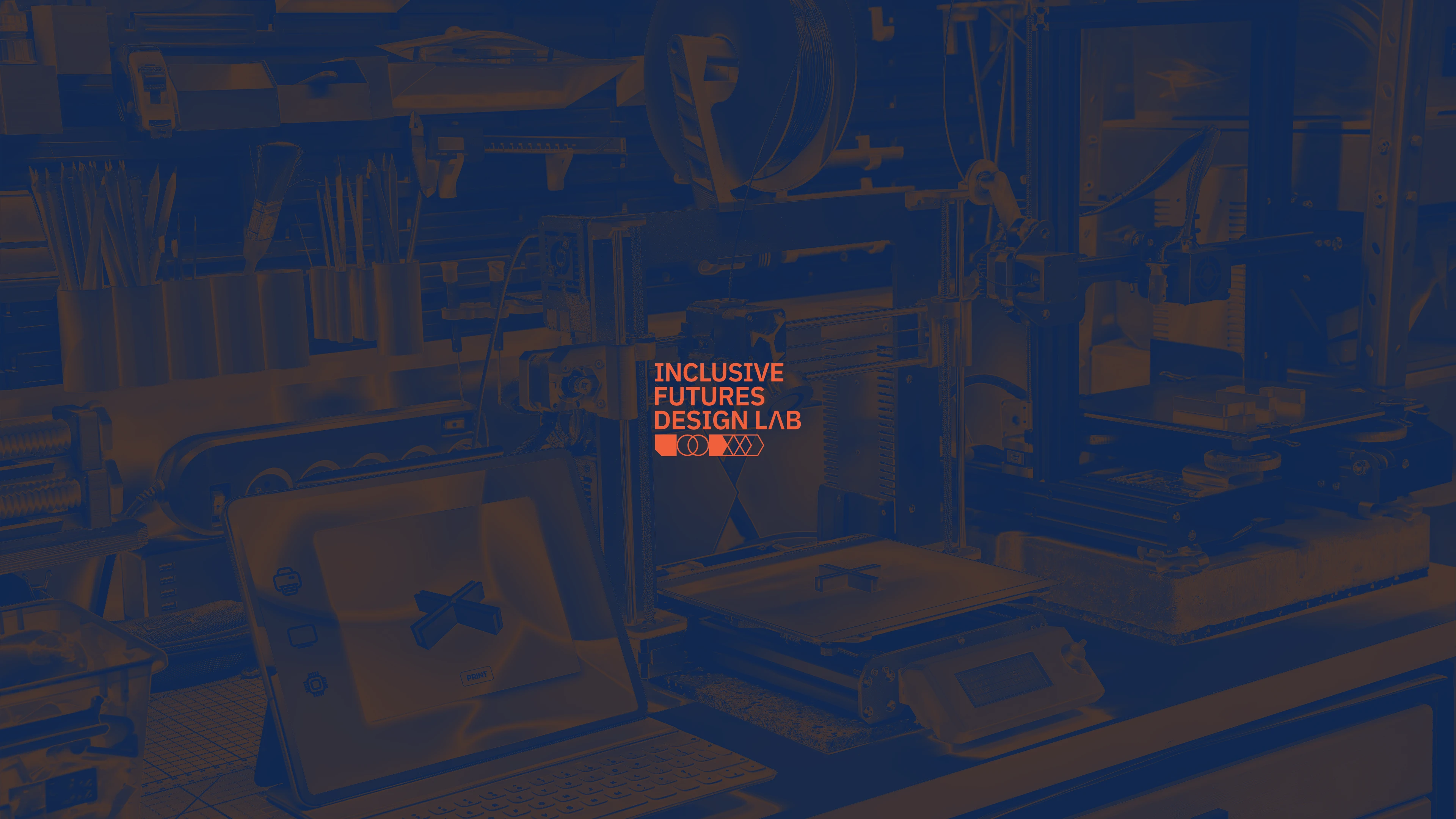
A brand identity developed for Griffith University's Inclusive Futures Design Lab, an initiative that connected industry professionals to academics to create tangible, accessible solutions for limiting environments.
I focused on an industrial aesthetic for the brand colours that would be functional when utilised for prototyping and production. The bright orange is a nod to high visibility applications highlighting hazards, risks, and tangible affordances.
By honing in on the design lab's fundamentals—Technology, Collaboration, and Design Thinking, the symbolism cements itself as its' driving pillars behind each concept and solution designed.
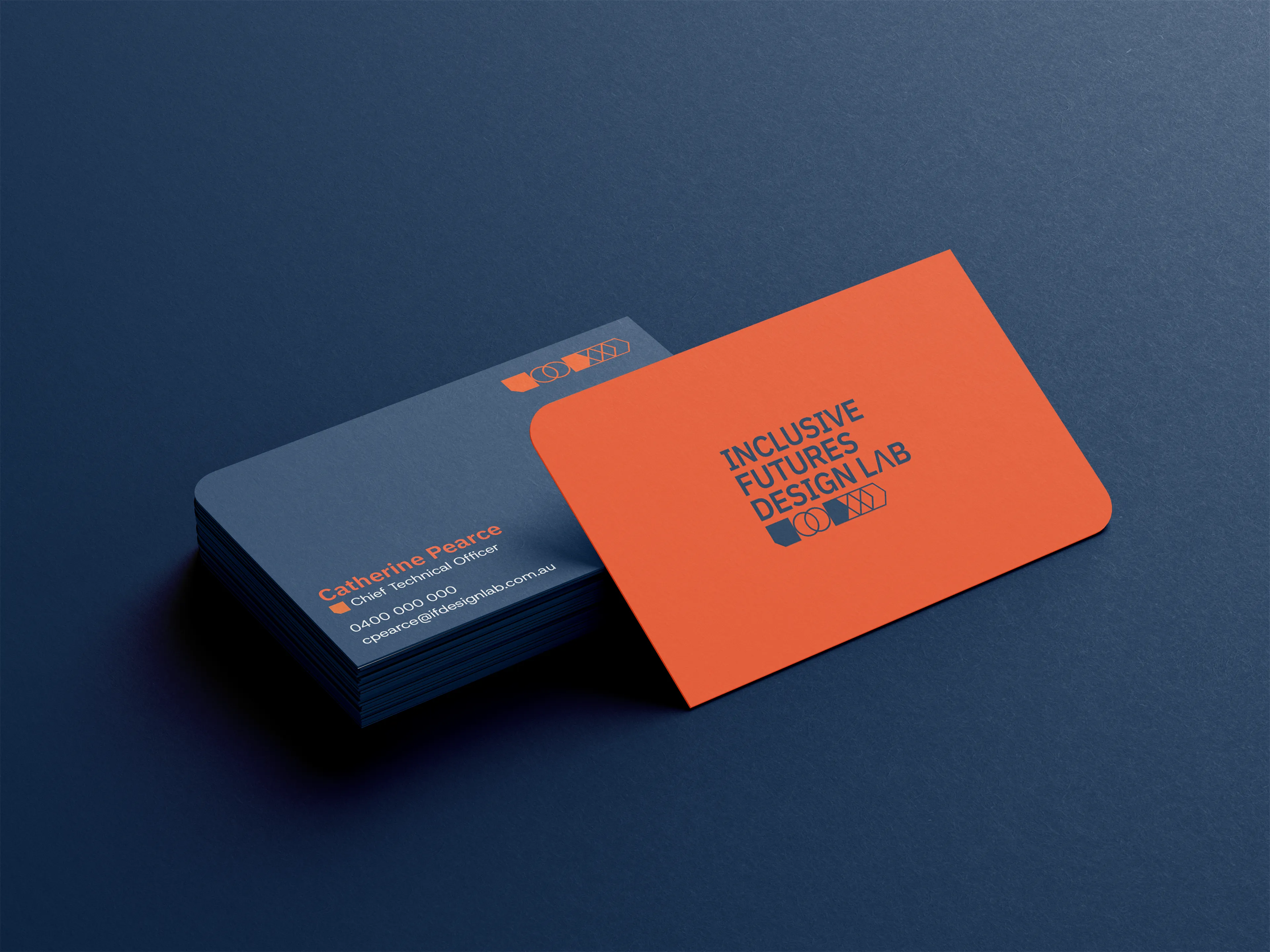

Purposed for longevity, I designed the brand based on fundamentals that were mentioned in the creative brief—core values that drove everyday business functions and creative direction.

Technology

Collaboration

Design Thinking
Each component of the brandmark is a notable icon that merge together to represent modern, functional design. The tangerine orange is a solid nod to industrial design, and the deep navy places the brand as a commercial-ready entity.


.svg)
See completed projects, concepts, and case studies.
